Showing posts with label cardstock. Show all posts

Sunday, January 21, 2018

Die Cut Gatefold Cards

Hello stampers and card makers,

I've been working on a friend's wedding invitations and wanted to show you how they turned out. This gatefold design is so pretty and elegant, but I do have to say they do take some time to complete. In the end my friend (the bride) is very happy with them and they were fun to do.

The invite inside the die-cut wrapping is removable. Here's of photo of just the gatefold wrap. The base and the sides have been die cut.


The design uses three different die cutting sets. Below are the instructions including sizes of the finished invitation.

Here's what you need:

  • White cardstock - cut 1, 5 x 7, cut 1, 6 3/8 x 4 1/8, and cut 2, 3 1/4 x 7
  • Colored cardstock (this invitation used Pool Party from Stampin' Up) - 4 15/16 x 7
  • Black cardstock - 6 1/2 x 4 1/4
  • Ribbon
  • Half-back pearl
  • Background die - I combined Swirling Grace and Victorian Crosses from Spellbinders
  • Border die - I used Gemini Dies from Creative Expressions
  • Adhesive - I used Tombow mono liquid glue
The finished invitation measures 5 x 7 and fits nicely into a standard sized envelope (don't need to special order envelopes this way). 

For the gatefold, use the background die on the white 5 x 7 piece and the border die on the 2 - 3 1/4 x 7 pieces.  Once the side pieces have been die cut, score 1/4" on the straight edge and fold. Glue the fold edges to long sides of the base to make the gatefold. I used a Big Shot to die cut my pieces. You could cut a piece that is 7 x 11 and use one of the larger die cutting machines. You  would than score at 3" and 8". This is where the panels would fold.

The invitation can be made by printing or handwriting the wedding day specifics on the remaining white cardstock piece.  Glue the white piece to the black piece and center that on the colored cardstock piece. 

To add the extra touch of elegance, make a small bow and adhere to the front of the left panel.  Place a half-back pearl in the center of the bow and you are done.

Here's another example of the same style but the color in on the outside of the gatefold.

This design could also be used for wedding and anniversary cards. Any special couple would love to get one of these cards.

I hope you give this a try.

Happy stamping!

Kathie K.

Monday, January 15, 2018

Gold Mirror Paper Accents

Hello fellow card makers,

I just love using gold, silver or copper mirror paper on my handmade cards - as layer borders or die cut accents.  The wine themed card below were a perfect match to gold mirror paper. The accents a somewhat subtle but you really get a bang for your buck.

The cheers sentiment was cut twice in gold mirror paper and it really pops off the card front. And it looks great with the gold cording.


This paper is very easy to work with and it die cuts beautifully.  I hope you add mirror paper to your next project.

Happy stamping,

Kathie K

Sunday, July 23, 2017

Polished Stone Background Technique

Hello Stampers,

The polished stone technique has been around for many years and is one that I still love.  I thought I would share my take on the technique and some projects that I have made.

My first tip is to have fun! I like to experiment with different colors combinations.  To do this, I use scrap pieces of glossy white card stock.  And to keep track of my experiments, I jot down on the back of the scrap the ink colors and the order in which I applied the ink to the paper.

When I do this technique, I find that I like to have more control of the amount of ink that is applied to the paper.  I apply one color at a time.  I only use one color of ink on each cotton ball.  This way I can apply more of one color to get the effect I am looking for. I saturate the cotton ball first with rubbing alcohol and then add two to three drops of ink. I then dab the inked cotton ball onto the glossy cardstock in a random fashion until I like the look.  I repeat this two more time with two different color inks until I get the look I like. The paper will dry slightly lighter. Here are color combinations that I experimented with:


I also like to include a metallic ink - usually silver, gold or copper - to give it an extra shimmer and true marble look. My preference is to apply the metallic inks first and then the colored inks next. However, if you are looking for more metallic color, it does work great on top of the colored inks. Below are to samples of each way.  When using non-alcohol metallic inks, you will need seal the ink. I simple spray a thin coat of hairspray and it seals great.  The ink does not rub off. Here are two samples - the first one I applied the silver metallic ink first; the second sample shows the technique with the silver applied last.


While experimenting, I wanted to see if I could create the black veins of marble using a black reinker. When the black ink is mixed with alcohol it actually turns a deep purple and I did not get the look I was planning.  However, the results were still interesting.  The sample below was done with black, navy and lighter shade of blue.


When you use your new polished stone cardstock, stamp images directly onto the paper using Stazon inks or emboss the image.  This will give you the best results. Here are a few cards that I made with the polished stone background:


I hope my tips inspire you to take another try at the polished stone technique.  I truly love this technique because every card is different and unique.  What a great way to showcase your creativity.

Check out my Etsy shop for cards that you can purchase.  Thanks for visiting by blog.

Happy stamping!

Saturday, July 8, 2017

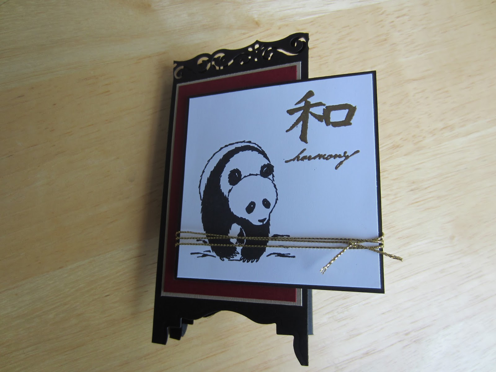
Panda Screen Note Cards

Hello stampers and card markers,

I have always loved Asian or oriental styles and themes, especially for greeting cards.  I think they are so universal and can be used for any occasion or sentiment. I finally got around to make a set of Asian themed screen or room divider cards. The instructions are below.

There are lots of videos and tutorials about how to make these cards - here are few tips that worked for me.

1. Make a prototype to make sure the finished size is what you want.  Border punches used for the top of the screen are all different.  Each one removes a different amount of cardstock slightly changing the finished size.

2. Use a label die cut if you don't have a punch.  I do not have the label punch that is shown is most videos but I do have a label die and it works great.  I was able to cut through two layers at a time and use the cut piece as a guide for the remaining panels.

3.  Put embellishments on the first panel.  You can embellish the inside panels but it may make the card harder to fold because of the extra layers of cardstock.

For the card set, I chose to stick with classic oriental colors - red, black and gold.


Cut a piece of cardstock for the screen base 11 x 5 1/2" and score at 2 3/4", 5 1/2" and 8 1/4". Keep in mind the border punch may remove more cardstock then the one I used - you may need to alter the dimensions slightly.  This will make the screen panels.  For the top of the screen, use a border punch that goes with your theme - really any punch will do. To make the feet of the screen, use a label punch or die like I have done here. Some punches will go through multiple layers.  If you cut or punch the one at a time, be sure they are lined up the best you can.

For each panel, cut four 3 7/8" x 2 3/8" sections red.  Dry emboss two of them and leave two smooth. I used a bamboo embossing folder but any kind will work.  You are just adding some textured interest to the card.

For the first panel, layer one of the smooth red section onto a gold section that measures 4 x 2 1/2". This will be the front of the card.  Then cut a black piece that's 3 3/8" square and white piece that is 3 1/4" square. Stamp an image on the white layer.  I stamped the panda in black and embossed the harmony image with gold powder.  You can use any kind of gold embellishment on the front - a gold tassel or brads would also be nice. I used a piece of gold cord wrapped around three times and then tied in a knot.

Adhere two of the embossed red sections to the 2nd and 4th panels.  For the third panel, layer a piece of white that measures 3 6/8" x 2 3/8" onto the last piece of unembossed red cardstock. Stamp an image at the bottom being sure to leave plenty of space for a written note.  Layer and adhere to the 3rd panel and your screen card is complete.

I made the box using the same cardstock and stamps.  The box holds five cards and matching envelopes.

I hope you like this card set and give this technique a try. If you are interested in purchasing this set, please visit my Etsy shop here.

Happy stamping!

Kathie K.

Wednesday, July 5, 2017

Wilderness Inspiration for Greeting Cards

Hello fellow stampers,

I just got back from a fabulous family vacation and feel very relaxed and inspired.  The mountains and wilderness were just breathtaking.  All this natural beauty inspired me to make this card.

I used the Noble Deer stamp set from Stampin' Up and the rest is a sponging technique.  I used several masks on the deer, sun and to the make the distant mountains. I am definitely not an artist so this is my best shot of a mountain lake and wildlife.


Inspiration can come from anything - just keep your mind and eyes open.  You will be making one of kind cards in no time.

Happy Stamping!

Tuesday, June 27, 2017

Wedding and Anniversary Cards

Hello fellow stampers,

Wow! What a crazy beginning to our summer.  So far three weddings and three big anniversaries.  I have to admit - I love make wedding and anniversary cards!  It's just another excuse for me to use my Big Shot and fancy dies.

For this wedding card, I cut out a large shape - any die will do, I used Spellbinders Label 20.  The negative space is nice to show some really pretty designer paper.


This next card was made for a special couple's 50th wedding anniversary.  This card uses several different dies - from Spellbinders - Fancy Framed Tags 2 and Oval Ironwork. From Stampin' Up, the oval nesting dies and from Creative Expressions, Gemini Pavo die.  The paper is vanilla or ivory colored cardstock with gold shimmer paper.  The "50" is heat embossed in gold.

This next card is made with the Eastern Palace suite - die and stamp set bundle from Stampin' Up.  The papers are also from the same collection - just beautiful designer papers.  The stamps are from several sets.  I couldn't find my Happy Anniversary stamp so I improvised and I think it makes the card very unique.  The medallion dies are layered with dimensionals to give it some life.  I am really enjoying this set - hope to post more samples soon.


I hope you get a chance to experiment with your dies.  Mixing and matching is really a lot of fun and you get something totally unique and stunning.

Happy stamping!


Wednesday, June 7, 2017

Father's Day Cards

Hello fellow stampers and crafters,

I really like making masculine cards.  I think the fellas in our lives are sometimes forgotten but they really like getting cards too.  These particular cards I made for Father's Day but the tags could say happy  birthday, congrats, happy retirement, thank you or just about anything.

I did not include a lot of embellishments.  The embossing gives the cards a nice clean touch,


 Think about making more masculine cards and give these a try.  You can find more cards on my Etsy shop at https://www.etsy.com/shop/handmadebykathiek?ref=seller-platform-mcnav.

Thanks for stopping by.  Happy stamping!

Monday, May 15, 2017

Mother's Day Cards

Hello fellow stampers and card makers,

I didn't have a lot of time to make mother's day cards this year.  Although the designs are simple, the impact was huge! I like to make cards for not only my mother but also aunts, sisters-in-laws, and good friends.  They all loved these cards.

The first card is made with a 2-step stamp set, the rose and leaves are stamped with two coordinating colors.  The effect is awesome.  I also added a little extra touch with pearls and clear embossing powder.


The second design has a vintage look using a script background stamp and adding age by sponging on a light brown/tan.  The extra touches on this card are the organza ribbon and pearls.


The size of both cards is 5 1/2 x 4 1/4 which fits an invitation size envelope.  I also stamp the bottom left-hand corner of the envelopes with the flower stamp - looks like a matched set.

Handmade cards do not need to be complicated to look complicated.

Happy stamping!

Airplane easel birthday card

  Crafting Joy: A Beautifully Designed Handmade Birthday Card Birthdays are a celebration of life, love, and the joy of making memories. Wha...