Showing posts with label dry embossing. Show all posts

Friday, August 10, 2018

Layering die cuts

Hello fellow stampers and card makers,

I hope you are off to good start to your weekend! Here's a card that I really enjoyed making. And it's almost all die cuts.


I first cut all the cardstock to the size of card I want and die cut the images. The base of the card is made from black cardstock and the background is made from teal. This layer is dry embossed using a honeycomb pattern. The cats are cut from three different colors - black, tan, and rust. The labels are cut from light teal or aqua, black and white.


I then made the embellishments. I used an aqua satin ribbon with a crystal rhinestones that will be attached to the main focal point. The sentiment is stamped in black on the white banner label. To give it added dimension, a black banner is also cut and adhered slightly offset to make a shadow. I also added rhinestones as eyes to the cats and as the center of the flower (used a sponge dauber to color the center of the white flower).
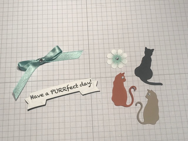

To make the focal point of the card, I cut the aqua colored labels in half as shown below. The aqua labels are the same size as the white. I adhered each end of the longer label under the black label. Then I adhered the smaller aqua labels under the white one with the aqua edge just visible. Then I attached that piece on top of the black label. Layered on the cat die cuts so the tails just touch (almost looks like a heart). Then attach the label and the flower, and the focal point is done.


I attached the dry embossed background piece to the card base. Then added the layered label focal point and the sentiment. I also added a white piece of cardstock to the inside of the card and stamped paw prints in the bottom corners as well on the envelope.


This makes a great birthday card for those cat lovers in your life. I hope you give die layering a try to make focal points for your creations.

Happy stamping!

Kathie K.

Wednesday, August 1, 2018

Personalized Cards

Hello fellow stampers and card markers!

I hope everyone is having a great day. Personalized gifts are always special - to give and to get. Everyone likes to have things with their names, initials or images that express their personality. Well cards can be personalized too.

I have a few examples of how to add that extra personal touch. You can personalize individual cards or make personalized gifts.

This first example is a card set I made for a gift. My friend Molly loves butterflies so this motif was perfect for her. And the card was super simple to make and she loved the set.


The next example I have was made for my aunt who loves send to cards.  I made her a set of cards in her favorite color and included both her initials. The dry embossing and pearl embellishments added a nice feminine touch. And she loved them!


My last example does not include initials but something they love. This birthday card was made for a customer that wanted to include her son's favorite beer.  I think this card is awesome - I love the look.
I found the label and logo online and used a circle die to cut both. The small logo is adhered directly to the crystal glazed bottle. The label is adhered to a larger label made from silver mirror paper.

I hope you give personalizing a try. Let us know how your friends and family like it.

Happy stamping!

Kathie K.
Thursday, July 26, 2018

Tarnished Metal Masculine Birthday Card Tutorial

Hello fellow stampers and card makers!

I am in love with this technique! Doesn't the background look like tarnished metal?

I think this technique is perfect for masculine cards - this one is a birthday card but you could make it work for any sentiment. It's so much easier than it looks and is sure to impress your friends and family.

Here's what you will need:

  • embossing folder
  • mirror cardstock - gold, silver, or copper
  • 2 - embossing powder colors
  • Stazon black inkpad
  • Versamark pen
For this card, I used silver mirror cardstock with gold and copper embossing powder. Any combination works, just use what you have. The background is made with a clock embossing folder. Tip: when dry embossing with mirror cardstock use a thinner sandwich in your die cutting machine.  Thicker sandwiches will press the folder too much causing the paper to tear. Once the paper is embossed, take the Stazon inkpad and lightly drag the ink across the raised images.  This gives it an aged look.

Make sure to dry the ink before moving to the next step. I use my heat tool to quickly dry the ink. Now comes the fun part. Using the Versamark pen, color in patches on the embossed piece leaving some of the mirror cardstock exposed. Cover with gold embossing powder shaking off the excess.  The powder only sticks to the Versamark ink and then emboss with a heat tool. Repeat the same process with the copper embossing powder. Continue to add both colors until you get the coverage you like.


To finish the tarnished metal look, add more Stazon ink by apply the inkpad direct to the paper. Again, use your heat tool to dry but be careful not the melt the embossing you already applied.


Next, I added an embossed happy birthday sentiment and made a simple embellishment. I think this card is stunning and so much fun to do!

I hope you give this technique a try.

Happy Stamping!
Kathie K.

Sunday, January 28, 2018

Adding color to dry embossed backgrounds

Hi stampers,

In my many years of card making, I would have to say dry embossing tools are the most improved. I loved them then and I love even more now. I've been playing around with adding more dimension and looks to my dry embossed backgrounds. There are many blogs and videos about adding color to the negative space of the embossing folder, but that doesn't bring the embossed areas to life.

For this card, I wanted the background to look like aged stone or a stonewall that maybe found in the Italian country side. For this card I sponge a couple of different earth tone colors - some areas darker than others. I think the background turned out great!


One of my other favorite embossing folders is the Tim Holtz tree branches. For this background piece I used a soft gray with a very light hand and sponged just the tops and edges of the branches.  I really think this adds even more dimension.


Super easy coloring technique to really bring those embossed areas to life.  Adding dimension to your cards will add that wow factor that your friends and family will really appreciate.

What other coloring techniques have you tried? Please leave me a comment - I would love to hear your ideas too!

Happy stamping!

Kathie

Saturday, July 8, 2017

Panda Screen Note Cards

Hello stampers and card markers,

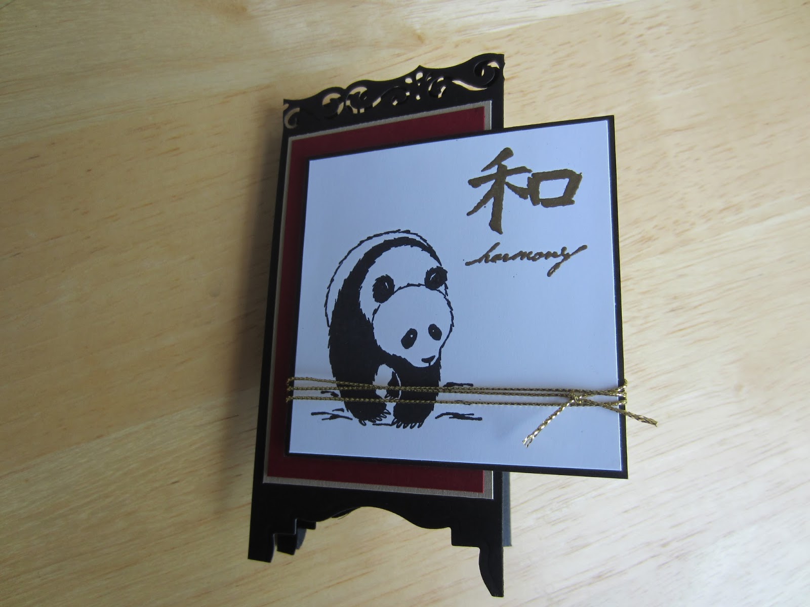
I have always loved Asian or oriental styles and themes, especially for greeting cards.  I think they are so universal and can be used for any occasion or sentiment. I finally got around to make a set of Asian themed screen or room divider cards. The instructions are below.

There are lots of videos and tutorials about how to make these cards - here are few tips that worked for me.

1. Make a prototype to make sure the finished size is what you want.  Border punches used for the top of the screen are all different.  Each one removes a different amount of cardstock slightly changing the finished size.

2. Use a label die cut if you don't have a punch.  I do not have the label punch that is shown is most videos but I do have a label die and it works great.  I was able to cut through two layers at a time and use the cut piece as a guide for the remaining panels.

3.  Put embellishments on the first panel.  You can embellish the inside panels but it may make the card harder to fold because of the extra layers of cardstock.

For the card set, I chose to stick with classic oriental colors - red, black and gold.


Cut a piece of cardstock for the screen base 11 x 5 1/2" and score at 2 3/4", 5 1/2" and 8 1/4". Keep in mind the border punch may remove more cardstock then the one I used - you may need to alter the dimensions slightly.  This will make the screen panels.  For the top of the screen, use a border punch that goes with your theme - really any punch will do. To make the feet of the screen, use a label punch or die like I have done here. Some punches will go through multiple layers.  If you cut or punch the one at a time, be sure they are lined up the best you can.

For each panel, cut four 3 7/8" x 2 3/8" sections red.  Dry emboss two of them and leave two smooth. I used a bamboo embossing folder but any kind will work.  You are just adding some textured interest to the card.

For the first panel, layer one of the smooth red section onto a gold section that measures 4 x 2 1/2". This will be the front of the card.  Then cut a black piece that's 3 3/8" square and white piece that is 3 1/4" square. Stamp an image on the white layer.  I stamped the panda in black and embossed the harmony image with gold powder.  You can use any kind of gold embellishment on the front - a gold tassel or brads would also be nice. I used a piece of gold cord wrapped around three times and then tied in a knot.

Adhere two of the embossed red sections to the 2nd and 4th panels.  For the third panel, layer a piece of white that measures 3 6/8" x 2 3/8" onto the last piece of unembossed red cardstock. Stamp an image at the bottom being sure to leave plenty of space for a written note.  Layer and adhere to the 3rd panel and your screen card is complete.

I made the box using the same cardstock and stamps.  The box holds five cards and matching envelopes.

I hope you like this card set and give this technique a try. If you are interested in purchasing this set, please visit my Etsy shop here.

Happy stamping!

Kathie K.

Airplane easel birthday card

  Crafting Joy: A Beautifully Designed Handmade Birthday Card Birthdays are a celebration of life, love, and the joy of making memories. Wha...